Projects
The best way to explain this project is by first describing the
incident that inspired it.
A few years ago I was conversing in the car with some friends,
when I was suddenly reminded of a meme I had seen on Instagram.
The meme was hilarious and more importantly it tied in perfectly
with the conversation we were having. I had to find it. I pulled
up Instagram and began my search. Although this post was only
from a few days ago, the unchronological timeline, limited
search functionality and overwhelming amount of content rendered
my search futile.
The struggle to find specific posts on a social media platform
is of course, largely by design. It’s something I like to call
the “IKEA Model”. To illustrate my point, imagine you are
shopping for a bed at IKEA. You walk into the store and follow
the only path available through the the retail displays. On the
way to the bedroom section, you walk through kitchens, living
rooms, dining halls and workspaces. It’s not long until the
intrusive thoughts kick in: “Ooh that’s a nice table, maybe I’ll
get that as well”, “this rug would look great in the living
room”. By the time you’ve made it to the beds, you’ve already
accumulated an entire shopping list worth of IKEA furniture.
Maybe you’ve even forgotten why you came to IKEA in the first
place.
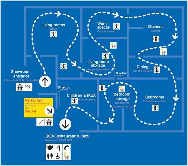
IKEA and Instagram follow the same design principle of being
inefficient by design. On route to finding that one post you
came for, the algorithm bombards you with dozens of posts that
it knows you’ll like. These companies don’t value your time,
they value your attention.
Fast forward to a couple of months later. I had learned a bit
about web development and as a result I found it amusing to use
`Inspect Element` on websites to see how they are built. Around
the same time I had also become fascinated by image recognition
software (see my `Image Recognition Tool` project below for more
on this). These two new interests would collide one evening when
I performed inspect element on an Instagram post and saw the
following under the 'alt text' of the image:
"This photo may contain text that says 'US OPEN' 2 people,
outdoors, tennis, Serena Williams"
Woah. It appeared as though Instagram had used automated image
recognition software to decipher the contents of the image
(check out this article to find out why). Something clicked.
Could I use this information to build my own advanced Instagram
search engine? At this moment, Instasearch was born. Here’s how
it works:
- Open the ‘Instasearch' Node.js app and remotely log into your Instagram account.
- Type in some key words related to the post that you are attempting to find (eg. soccer, field, ball, outdoors, ‘when you’re trying to…’), as well as the page name (eg. complex, babyyodamemes, serenawilliams).
- Press enter and wait for Instasearch to do its thing. In the background, it is using a headless Chrome browser controlled by Puppeteer API to scroll through the provided Instagram page. In less than a minute, it’s able to scroll through over 100 posts, retrieving the ‘alt text’ of each image.
- Once complete, Instasearch will return the links and ‘alt text’ of the posts with the most keyword matches.
- If at this point if you still haven’t found the post that you’re after, you can increase the search count, add more keywords or try a different account.
Now let’s talk about some of the shortcomings of this project:
- For starter’s this project falls under the legal grey area of ’web scrapping’. For this reason, I have decided it would be unwise to publish this project. However, if you would like a demo of this project or a peep into the code, I would be happy to give you a tour.
- Modern image recognition software is incredibly powerful (see Google Vision AI). However, it’s also incredibly expensive to process a large number of images. For this reason, Meta has chosen to go with a very simple image recognition system. This system is excellent at reading text from an image, but it struggles to detect objects and finer details. This limits the search capabilities of this application.
- If you are wondering why I don’t run each image through a superior third part image recognition software, there are two main reasons. The first is that each image could take up to several minutes to process. This means that a simple 100 post search could take hours. The second reason is cost. As previously mentioned, this software is expensive and not meant for mass image processing.
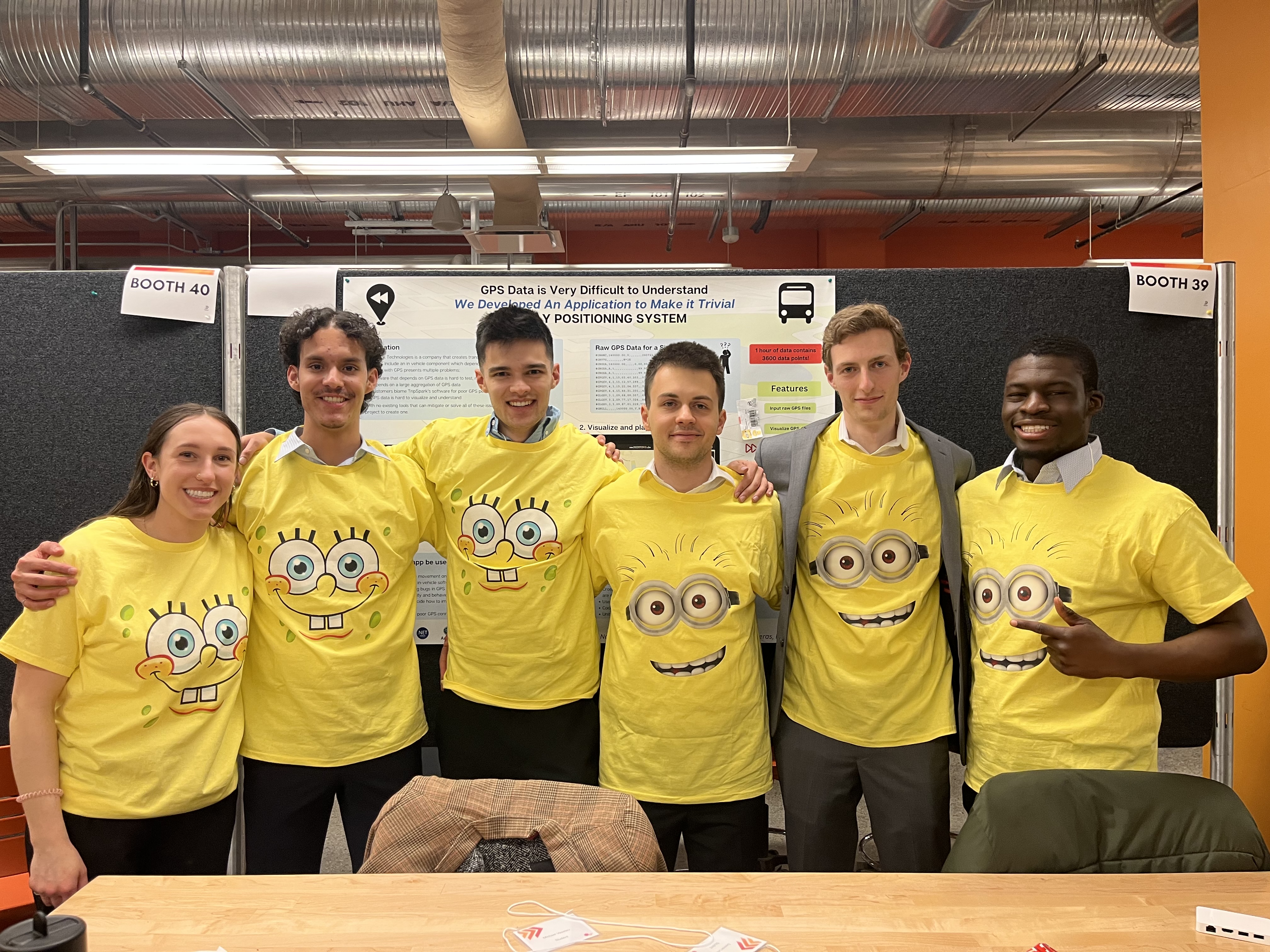
A Capstone project is a right of passage for any software
engineering graduate. For my capstone project, I was very
fortunate to collaborate with 5 of my close friends on a project
for our sponsor, TripSpark Technologies.
The premise of the problem that our capstone project solved is
this. GPS data is difficult to understand. For TripSpark, GPS
data is a core component of their transportation software
solutions. Many of their customers, such as public transit,
rideshare and NEMT, have in-vehicle solutions that depend on GPS
data for location-based features. Any of these features can have
bugs that are caused by poor GPS data, however, they are
difficult to troubleshoot, understand and reproduce. To help
TripSpark solve problems that they face when handling GPS data,
a solution was proposed to be developed as a Capstone design
project.
The solution aimed to improve troubleshooting GPS-related bugs
and issues by providing TripSpark with an application to
visualize GPS data and simulate vehicle movement in the field. A
data visualization and replay tool will decrease the amount of
time spent troubleshooting, reproducing GPS related bugs and
testing or validating location based software. Not only will the
application be used for TripSpark’s software developers, it can
also be used by TripSpark’s customer care agents or deployment
specialists to explain GPS behavior and phenomenon to clients or
to help them improve their fleet’s GPS reception by better
analyzing GPS data.
Unlike many other Capstone projects that are inherited from
previous years groups or handed off partially completed by a
sponsor, our project was to be planned, designed, built and
tested from the ground up in just 7 months. This was a huge
undertaking for our small development team that was also
juggling several other final year courses. I am proud to say
that we were able to complete the project, delivering on all
aforementioned features and much more. The tool is currently
being used by TripSpark employees to assist in their everyday
work.
To complete this project as gracefully as we did, a lot of
planning took place. We set our team up with interim milestones
based on feature dependency and importance. We went through
several design and redesign phases based on shifting project
requirements and uncovered platform limitations. We followed an
agile development process, partaking in sprints and dividing
large tasks into actionable tickets. We designed the project
architecture, adhering to object-oriented design principles and
a Model-View-ViewModel (MVVM)
design pattern. We made mockups,
following UX design principles and sponsor feedback to achieve
the optimal end-user experience. We went through strenuous code
reviews and design meetings to ensure our code not only worked,
but was optimal. We did a whole lot, and more importantly we did
it well.
Although I could not have done this project on my own, I must
now talk about my personal contributions. This is, after all, a
personal portfolio. I will list what I believe were my three biggest
contributions to this project:
1. Creative solutions
I believe that one of the biggest assets I brought to this
project is my open-minded and creative approach to problem
solving. This is hard to quantify, so I will attempt to do so by
giving an example.
Early on in the project, we decided that upon clicking on a data
point on the map, a popup should appear displaying the
information of that point. This would enable the to user to
quickly glance at information along the vehicle route, without
having to scroll to that point in the timeline. This was a great
idea because correlating the scrollable timeline to a physical
point on the map isn’t always that intuitive. This is specially
true when the vehicle is moving in a route that overlaps several
times over (which is common for many of TripSpark’s transit
clients). But what if the user did want to move that point in
the timeline? What if this specific area was a point of interest
for them, and they wanted to resume playback from that point in
time. Upon considering this use case, I suggested the idea that
a double-click on a point should move playback to said point.
The group along with the sponsor agreed that this would be very
useful.
Reality (which for developers consists of the chosen platform)
can often be disappointing. Due to MAUI’s multi-platform
capabilities, double-click is not an actionable event. When this
was discovered during a design meeting, we tried and failed to
come up with a workaround. We had no choice but to scrap the
double-click feature. This would be disappointing for the
sponsor as this was one of the features we had promised, but
there is only so much that us as developers can do when bounded
by technological limitations. We had to move on with the meeting
and the project.
As the meeting went on however, I could not stop thinking about
this conundrum. I thought back to how excited TripSpark was when
we mentioned this feature. Although this feature fell squarely
into the “nice-to-have” category, it’s usefulness was not lost
on me. These types of features are what take an application from
good to great.
I took a step back and tried to look at the “bigger picture”. I
think that as developers its really easy to get stuck with
“tunnel vision” which forces us to focus on the wrong problem.
We end up trying to fix the solution, instead of focusing on the
root problem. The goal was not to double-click, the goal was to
navigate to a point on the map. This distinction is important.
After some thought, I proposed an alternative to the group. To
add a button on the popup itself to navigate to that point.
Ultimately and to the delight of our sponsor, this was solution
that I ended up implementing. A slight change in perspective is
what took an idea from the chopping block to production.
Although this solution may appear as being trivial in hindsight,
its the path to getting to a trivial solution that is often the
complicated bit. It requires us to be creative, to “think
outside the box”, to widen our perspective and narrow our
intention. I attribute many of my career and creative
accomplishments (including this project) to my competence in
this skill.
2. Mr. Playback
One key feature of this application was the ability to simulate
real-time GPS playback. Let me explain what that means. Our
application takes in raw GPS data in an NMEA file format (raw
text). This data then needs to be processed and converted into
useable GPS data points containing information such as
coordinates, time, vehicle speed, etc. Once these data points
are created we can do two things: plot the vehicle route on the
map and playback the vehicle position in real-time. The latter
was one of my main tasks throughout this project; eventually
earning me the name, Mr. Playback.
To accomplish this task, I created a service within our
application exclusively for playing back through the data
points. I used the timestamps on each data point to iterate
through the data in chronological order. Each time the playback
service would reach a new point, an event would be emitted
indicating the vehicle’s new position. This event was then
captured on the front-end of the application, where an event
listener would use the new information to animate a vehicle icon
to its new position. This gave the appearance of the vehicle
moving along the screen.
Additionally, this same “new position” event could be captured
by a separate simulation service. This service could output the
data to a socket, simulating data coming in from a live GPS
module. This functionality enabled our application to be used as
a GPS simulation source.
The real headache with the playback service was in integrating
it alongside many of our other features. For example, the
vehicle playback could be paused, played, sped up, slowed down
or moved to a different point in the timeline altogether. The
playback service needed to be able to react gracefully to all
these scenarios. This was specially tricky as many of these
features were being built asynchronously by myself and other
members of the team. This is where strong communication and
agile development was crucial to our success. For instance, when
a team member was working on the UI for playing and pausing
playback, we collaborated to ensure that the correct events were
being triggered on their end (frontend), so that I could make
the playback (backend) react accordingly. Collaborations like
this didn’t just happen by chance. They were predetermined
during our sprint planning. Although it’s not always the most
exciting part of our job, planning is the fuel that makes the
development train roll.
3. User Interface Design
Six people read the project description and six people visualized a nuanced solution. That is both the
beauty and the struggle of group work. How do you combine six visions into one cohesive and tangible
reality? How do you highlight the common ground in each design while not erasing the differences that make
each one stand out? These were the tough questions that we had to answer early on in our project.
Our process started individually. Each team member designed a UI mockup with what they envisioned for the
application. The goal with this was to give each team member full unbiased creative freedom. Once this was
complete and the mockups were presented to the group, I took on the tough challenge of combining
everyone’s ideas.
I started out by focusing on the big “must-have” features or design elements that the team had decided
were essential to the application. These features were the backbone of our application. I then turned my
attention to other interesting features or ideas that had been brought up during the demos. Many of these
ideas clashed, which required me to create alternative design options for the team to evaluate. One key
thing that we learned as a group during this process was that it can often be hard to accurately evaluate
an idea until a fleshed out mockup or nonfunctional prototype is presented. Once I had created a set of
mockups that I was pleased with, I presented them to the group for further critique and evaluation. This
process was repeated several times over until a final mockup was agreed upon.
The process of UI/UX design can often feel detached from the regular work of a software developer.
In fact, the roles are often separated into two separate positions (ie. Software Developer vs UX Designer).
This is because both fields are complex and require their own specific skill sets. However, I think that
as a software developer it’s important to at least learn the fundamentals and principles of UI/UX design.
Learning these skills helps us developers get into the minds of the end-user and to better interface with
stakeholders. In a way, it bridges the gap between the digital world and the physical.
Using TypeScript I created a tool that allows users to upload an
image and highlight points of interest/disinterest on said
image. When the user presses the output button, a JSON file is
produced which holds the coordinates of each annotation relative
to the image.
This project was completed with one goal in mind: to dip my toes
into image recognition software; a topic that I have always been
fascinated with. My interest in this topic sparked when I
listened to
this podcast about
the founder of reCAPTCHA. Beyond stopping the rise of bots on the internet, it was
eventually used to digitize millions of articles, aid in modern
image recognition, and much more. I strongly recommend that
podcast episode if you are at all interested in image
recognition.
At the time of working on this project I did not have any
experience with machine learning. Hence the manual selection of
objects on the image. Now that I have taken a course on neural
networks, I think it would be interesting to revisit this
project and apply some automation. Take the demo above showing a
dashboard camera as an example. By training a model with a
traffic signal dataset, we could automatically detect common
traffic signals such as stop signs or red lights. This would
allow the user of the application to focus more on unique points
of interest (POI) on the image. We could even take this a step
further and allow the user to label their POIs, and then use
this information to build our own datasets on common traffic
POIs. Google has used a similar technique (via making
users fill
out reCAPTCHAs) to aid in their image recognition software.
Pretty cool if you ask me!
This was one of the first big(ish) individual projects that I
worked on, and it shows! Simply put, the code is a mess. I would
be lost trying to explain it to you. That being said, it was a
big accomplishment for me at the time. Building something that
works and having it be available for everyone to see on the
internet is a pretty cool feeling. It's even cooler to look back
on this project and see how much I've grown and improved since
then. Maybe I'll revisit this one day.
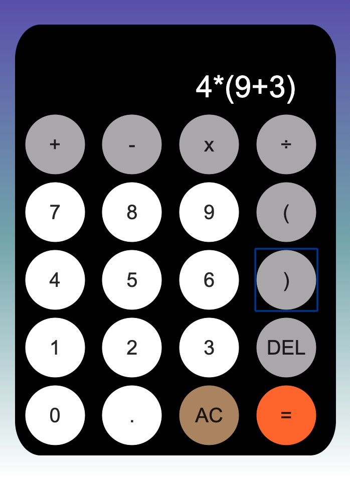
This project was my first proper dive into learning JavaScript
and functional programming. After working through the Mozilla
JavaScript course, I wanted to apply my new skills by building a
project.
I chose a calculator because it was simple, while still
providing some interesting challenges. For example, the `-` key
must act as both a subtraction sign, and as a negative sign
depending on the operation (e.g. multiplying a negative). Little
nuances like this seem trivial, but it when it comes to
implementing them yourself, they do take some thought. This
project was full of little edge cases that forced you to write
helper functions and implement some error handling.
Another fun challenge with this project was to make it look
good. I decided to style the calculator similar to the Apple
calculator app. It was fun to play around with CSS until I got
the result that I wanted.
Overall, this was a fun beginner project that provided a lot of
learning opportunities. I recommend it to anyone who is learning
functional programming or web development!
This is the worst project on this page, but arguably, my
most important.
As part of the first year engineering curriculum at UofC,
everyone had to take a programming course. To many students,
myself included, this was our first time ever writing a line of
code. I would love to say that I was a natural and that I
instantly knew I wanted to do this for the rest of my life. That
was not the case however.
I have vivid memories of sitting on the top floor of the Taylor
Family library, metaphorically (but almost literally) banging my
head against the keyboard attempting to get a digital ball to
loop around the perimeter of my laptop screen. Learning
to code is hard. It requires you to unlock a different way
of thinking. I remember being frustrated but ultimately
mesmerized when I finally got that damn ball to loop. I had done
something. Unlike integrating a function or solving a
derivative, the result wasn’t just a number, it was a tangible
thing. I could have watched that ball loop for hours.
Every Friday I would go up to the library and work on that
week’s coding assignment. As the semester went on, I slowly but
surely began to love programming. Sure it was hard, but boy oh
boy was it ever rewarding. If you yourself are a programmer, I’m
sure you know the feeling.
As the semester came to a close it was time for the final
project, a car dashboard. The objectives were as follows: using
an Excel file containing the distance travelled, RPM and fuel
tank level of a commuter vehicle over a 10-minute period, build
a car dashboard to display the speed, fuel economy and range of
the vehicle in real-time.
Considering the rudimentary programming skills that I possessed
at the time, this was a very daunting task. It was my first time
processing raw data, creating a real-time simulation and
building anything close to this scale. It required a lot of
research, stack overflow and caffeine. I spent many hours on
this project, but the more I worked on it, the more I enjoyed
it. It was fun to build something from the ground up and see it
come together before your eyes. Before long I had all of the
base requirements completed. Most sane students at this stage
would have submitted their project. This was first year
engineering after all and we had four other tough courses to
worry about. I however did the insane thing, and continued to
work on it.
I’m not sure what came over me. Maybe it was my love for cars or
the lack of sleep driving me crazy, but I just wanted to make
this project as cool as I could. I added 2 different car
options, an odometer, a gear indicator, a compass and much more.
I even pulled an all-nighter figuring out how to add a radio
that let you choose between 3 different songs. Ultimately, I
think what drove me (pun intended) to work on this project was
that I simply enjoyed programming more than any other course.
This revelation was not lost upon me. I think this project was
the final nail in the coffin that convinced me to major in
software engineering. For that reason, and that reason alone, it
deserves a spot on this portfolio page. Sure the code is a mess.
It violates every single object-oriented principle and is more
confusing than a Christopher Nolan movie. And yes it was built
in Processing which isn’t even a real programming language. But
I don’t care about all that.
There are few things I’ve worked on in my life that have been as
impactful on me as this project. It steered my life (see what I
did there?) in a wonderful direction and for that I am forever
grateful. Thank you Car Dashboard, may your unhinged codebase
live on forever.